NIHAM
Niham sells Volvo and Lynk & Co from four locations in the South Holland region: The Hague, Zoetermeer, Naaldwijk and Wassenaar.
%20(1)-p-1600.jpg)
About this project

Niham's ad traffic for the new EX60 was landing on a news article. We designed and built a landing page made to convert instead, and it was tested head to head against the original on live campaign traffic. Same budget, same ads, same audience. Only the page changed.
-p-1600.jpg)
-p-1600.jpg)
-p-1080.jpg)
-p-1600.jpg)
Client Introduction
Niham sells Volvo and Lynk & Co from four locations in the South Holland region: The Hague, Zoetermeer, Naaldwijk and Wassenaar. For the introduction of the EX60, Volvo's new fully electric SUV with a range of up to 810 kilometres, the dealer ran an advertising campaign with one clear goal: test drives and quote requests.
This was a three-party project, and it is worth being precise about who did what. Chase Marketing ran the advertising. Neuroo led the conversion analysis and proposed validating a purpose-built landing page against the existing one. We did the design and the development. The budget, the ads, the targeting and the audience were not ours and did not change during the test. The page was ours, and it was the only thing that moved.
The Challenge
That ad traffic landed on a news article in the "Actueel" section of the website. That is not sloppiness, it is the default route. A new model arrives, marketing writes a post about it, and the campaign points there. Almost every dealer and every retailer works this way.
There is a break in that route. A news article is designed to inform. Someone who clicks an EX60 ad is past that stage. They want to know what the car costs, how far it goes, how fast it charges and where they can test drive it. And they want to know it within a few seconds.
Going through the existing page, four things stood out as structural brakes on conversion.
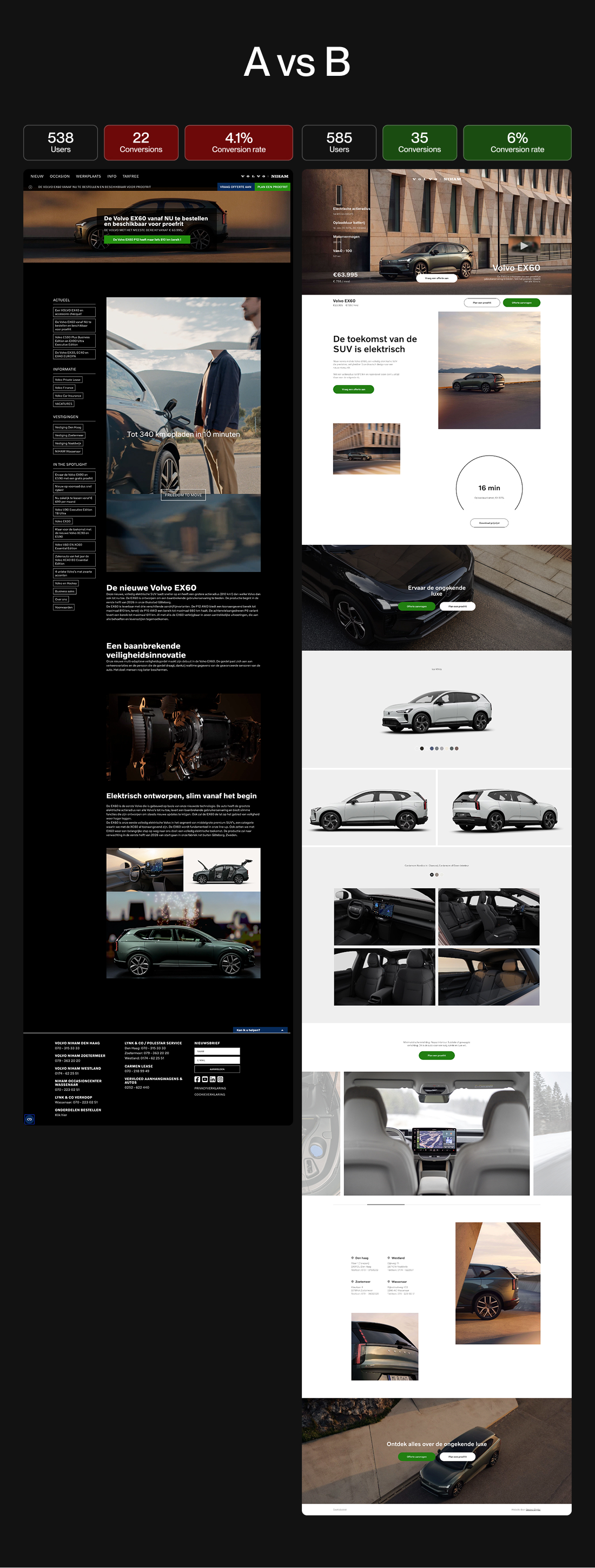
- The call to action disappeared on scroll. "Request a quote" and "Book a test drive" sat in a narrow bar right at the top, above the hero. Outside the natural reading direction, and gone the moment the visitor started scrolling. At exactly the point where someone becomes convinced, there was nothing to click.
- The price was a footnote. €63,995 sat in small subtext under the heading, while price at this stage of the purchase is the first filter: does this fit my budget, yes or no.
- The decisive specifications were buried in running text. Range, charging time and power are precisely the numbers an EV buyer uses to compare models side by side. On the old page you had to read through two paragraphs of manufacturer copy to find them, including a passage on multi-adaptive seatbelts.
- There were twenty exits. The sidebar was full of links to other models, other locations, vacancies and terms. Every link is a chance that paid traffic walks away from the goal it was bought for.
Which led to a hypothesis worth testing:
Ad traffic with purchase intent converts better on a page designed to convert than on a news article. Remove the distraction, put the specifications and the price directly in view and keep the call to action always within reach, and the share of visitors requesting a test drive or a quote goes up.
Neuroo and Chase Marketing proposed putting that to the test rather than assuming it: run the new page alongside the existing one and split the live ad traffic between them. A hypothesis you do not measure is an opinion, so we were happy to design against a scoreboard.
The Approach
We designed and built a standalone product page on its own subdomain, autos.niham.nl, with exactly one job.
This is the part worth dwelling on, because nothing below is decoration. Every choice is a conversion decision that happens to be expressed in layout, hierarchy and typography. That is what we mean when we say we design with conversion in mind: the aesthetics and the mechanism are the same thing, not two phases of the same project.
- One path, no exits. No site navigation, no sidebar, no related articles. The visitor can go forward or leave, and forward has been made easier.
- The four decisive numbers above the fold. 810 km range (WLTP), 16 minutes charging from 10 to 80 percent on a 400 kW charger, 680 hp, and 0 to 100 in 3.9 seconds. Straight into the hero, next to the car.
- Price next to the button. €63,995 and €799 per month, large and directly beside the first call to action. The visitor knows where they stand immediately, and does not have to go looking.
- A call to action that travels with you. A bar that moves with the scroll, carrying the model, the price and two buttons: "Book a test drive" and "Request a quote". Whatever point the visitor becomes convinced at, the next step is one click away.
- A second, lower threshold. Not everyone is ready for a test drive. So "Download the price list" sits there too, which means the visitor who is still thinking it over is not lost but visible.
- Room to choose. A colour picker with nine paint options, exterior shots from multiple angles and an interior gallery. You buy a car with your eyes as well.
- Knowing where you end up. The four locations with address and phone number at the foot of the page. You book a test drive at a place, not at a website.
Results & Impact
The test ran on real ad traffic, split evenly across both pages.
- The current page: 538 users, 22 conversions, a conversion rate of 4.1%.
- The new page: 585 users, 35 conversions, a conversion rate of 6.0%.
On this outcome there is a 93% probability that the new page outperforms the existing one.
Translated to the full traffic of 1,123 users: had everything gone to the current page, it would have produced 46 requests. Had everything gone to the new page, 67. A difference of 21 extra test drives and quote requests, on exactly the same ad budget.
What that is worth
A conversion rate is an abstraction. For a dealer, one thing counts in the end: how many extra cars end up on a customer's driveway. So we ran it through, step by step, with assumptions deliberately chosen on the cautious side.
- Start with the 21 extra conversions the test produced.
- Assume 60 percent of those become test drives. That is 12.6 test drives.
- The remaining 8.4 are quote requests, and we value those at €0.
- Apply a test-drive-to-sale conversion of 20 to 30 percent. That is 2 to 4 extra EX60s sold.
- At the entry price of €63,995 per car, that comes to €160,000 to €240,000 in expected extra revenue.
Out of one test, on one model, without a euro of extra ad budget.
To be clear about what that number is: it is a calculation based on industry benchmarks, not a bank statement. And every step in it is rounded down on purpose. Industry figures for test-drive-to-sale conversion range from 20 to 40 percent, and depend more on follow-up and sales training than on the brand, so we use the lower half of that range. We valued the quote requests at zero euros, which is demonstrably too low, since a quote request is a warm lead with real sales value. And we calculate with the entry price of €63,995, while the actual transaction price with options and higher trim levels is almost always higher. Rounded down three times, and a six-figure number still remains.
The next step is rolling out the same approach across the rest of the range.
What you can take from this
The interesting thing about this case is not the EX60, and it is not really the test. It is that the budget, the ads, the audience, the targeting and the car were all held constant. The only variable that moved was the page, and a page is a design decision.
That is the argument for treating design as a conversion discipline rather than a finishing layer. A landing page is not the campaign's packaging. It is where the campaign either pays off or does not.
So if you advertise and your traffic arrives on a news article, a category page or a general homepage, you are probably paying for visitors you then let walk. That is rarely a budget problem. It is rarely even a media problem. It is a destination problem, and a destination is something you design.